# Mobile first indexing: make WordPress work on phones
> Mobile first indexing means Google uses your site's mobile content for indexing and ranking, so your WordPress site needs to work well on a phone. Visitors should be able to read your services, open the menu and contact you without zooming or fighting the layout. We check those tasks alongside accessibility, because a page that fits the screen can still be difficult to use.
Canonical: https://fer.marketing/mobile-friendly-wordpress
Author: Fernando Marcano, Fer Marketing
Updated: 2026-10-17
- **Google:** Mobile content is the indexing source
- **Screen checks:** 360, 390, 414, 768 and 1024 px
- **Accessibility:** Automated checks plus manual testing
- **Business goal:** Readable services and working contact routes
## Mobile first indexing starts with your customer
Phones account for more than half of web traffic worldwide in [StatCounter's platform data](https://gs.statcounter.com/platform-market-share/desktop-mobile-tablet). Your own audience may differ, so check your analytics before deciding which devices deserve extra attention.
Imagine a prospective customer opening your service page from Google while away from their desk. If the phone number is plain text, the menu stays closed or a banner hides the form, they have to solve your website before they can hire you.
- **Read the offer.** Make the service, location and next action clear on a narrow screen. Keep useful details available without forcing visitors to enlarge the page.
- **Reach a person.** Provide a working tap-to-call link and a usable form. Test the actual contact route instead of assuming a visible button works.
- **Keep content visible.** Review the mobile page as carefully as the desktop version. A service explanation removed from the mobile layout no longer helps someone reading on a phone.
Begin with the pages that bring inquiries: key services, contact, booking and any paid landing pages. Our [WordPress web design guide](https://fer.marketing/wordpress-web-design) connects this work with the wider site plan, while [conversion optimization](https://fer.marketing/wordpress-conversion-optimization) covers the reasons people take the next step.
## Mobile first indexing: keep the full useful page
[Google Search Central](https://developers.google.com/search/docs/crawling-indexing/mobile/mobile-sites-mobile-first-indexing) explains that Google uses mobile content for indexing and ranking and recommends responsive design. Keep equivalent main content, headings, metadata and structured data on mobile; avoid requiring a tap to load primary content.
### A WordPress mobile friendly theme is a starting point
Responsive design lets one page adapt to different widths. A theme may support it while an added pricing table, embedded booking tool or page-builder section still creates a problem, so review the finished pages with their real content.
**Tell the browser to use the device width** (correct)
```
```
Check the existing theme output before adding anything. Keep one correct viewport tag and allow visitors to zoom.
The viewport tells a mobile browser how to size the page, as explained in [web.dev's responsive design basics](https://web.dev/articles/responsive-web-design-basics). Without it, a phone can display a shrunken desktop layout even when parts of the styling are responsive.
> **Check the page Google actually receives:** Use Search Console URL Inspection to review a rendered page when indexing is in doubt. Compare important text with the visible mobile page, then investigate missing content or blocked resources; a sitemap alone cannot fix an unusable layout.
For discovery and indexing checks beyond the screen layout, see our [WordPress sitemap guide](https://fer.marketing/wordpress-sitemap). Treat mobile usability and indexing as connected checks with their own evidence.
## Make your WordPress site mobile friendly
Start with the element causing the failure: a fixed-width column, an oversized image, a long heading or a table. Hiding all horizontal overflow can conceal content and focus outlines, so repair the source before applying a page-wide workaround.
| Problem | Visitor sees | Repair |
| --- | --- | --- |
| Wide section | Sideways page | Flexible widths |
| Tiny text | Pinch to read | Readable type |
| Long heading | Broken words | Space + wrapping |
| Tight buttons | Wrong tap | More spacing |
| Sticky popup | Hidden content | Smaller footprint |
| Wide table | Cut-off cells | Stack or local scroll |
**Allow long text to fit its container** (correct)
```
.service-title {
min-width: 0;
overflow-wrap: anywhere;
word-break: normal;
}
```
An example for the person implementing the fix. Give headings room to wrap at spaces first; breaking a long unbroken word is a fallback.
Our QA rule at 390 px is no page-wide horizontal overflow, centered grids and complete text. We also inspect 360 and 414 px, then 768 and 1024 px, because a layout can fail between a builder's preset previews.
> **Give tables their own plan:** A short comparison can become stacked cards on phones. When column relationships matter, keep proper table headers and use a clearly indicated, keyboard-accessible scroll area around the table; the rest of the page should stay within the screen.
## A mobile menu must work after the first tap
A hamburger icon is useful only when the menu opens, its links are reachable and the visitor can close it. Check it after scrolling, with the cookie notice visible and with the phone turned sideways, because competing fixed elements often expose problems.
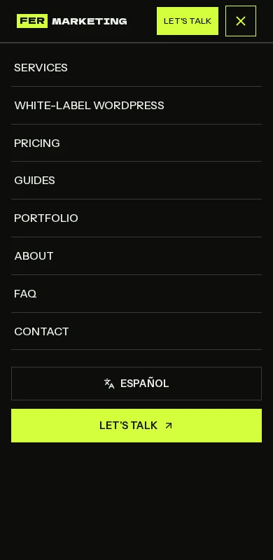
*Our English mobile menu at 390 px. An open-menu capture records the layout; taps, closing and keyboard behavior need separate tests.*
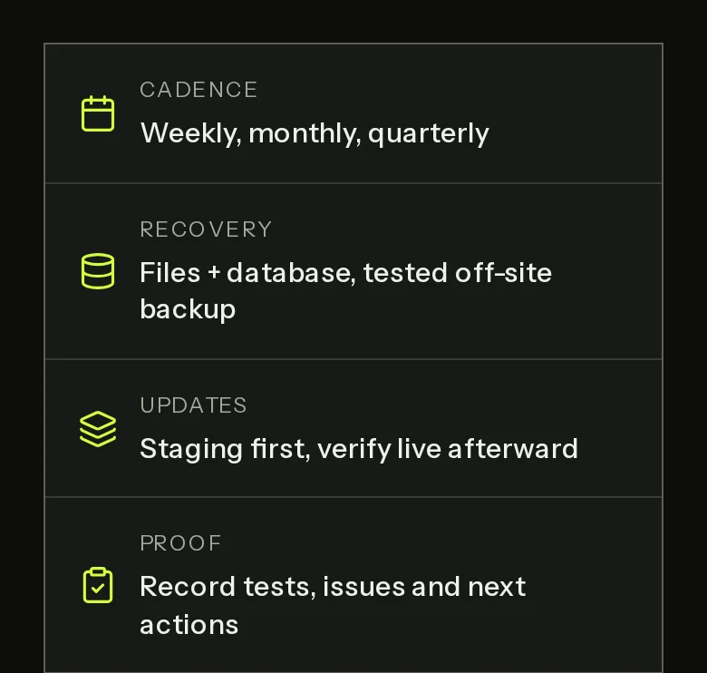
*Our guide at a 390 px viewport, captured at twice the pixel density. Summary cards stack with readable text and consistent side spacing.*
These screenshots come from fer.marketing, which is built with Next.js. They illustrate the same principles we apply on WordPress: sensible stacking, space for real wording and navigation that deserves its own test.
**Our navigation acceptance checks**
- [ ] The hamburger opens and closes reliably.: Test touch and keyboard, visible focus and the expanded state announced to assistive technology. If the menu acts as a modal, verify focus stays inside until it closes and then returns to the trigger.
- [ ] Every link can be reached without a hover.: Include submenus, the language switch and the contact action. A long menu must remain scrollable without trapping the visitor.
- [ ] Fixed elements leave the task usable.: Check headers, chat buttons and notices together. They must not cover the close control, focused field or final submit button.
## Make calling and mobile forms easy
Our [October 2026 study of 300 law firm websites](https://fer.marketing/studies/law-firm-websites-2026) found simple mobile foundations missing. These are checks of website HTML, not estimates of missed calls or a claim about every industry.
- **15%** Had no tap-to-call link
- **4%** Lacked a viewport meta tag
Source: Fer Marketing, 300 law firm websites, October 2026. See the linked study for scope and method.
Make the published business phone number a tel: link and confirm it opens the phone's calling interface. For forms, keep a visible label on every field, ask only for necessary details and choose keyboard types that match the information requested.
**A labeled phone field with a telephone keyboard** (correct)
```
```
Use type=email for email addresses. A telephone field helps input but does not validate every phone format, so avoid rules that reject legitimate customers.
Submit with the on-screen keyboard open and deliberately leave a required field blank. Errors should explain the repair, preserve what the visitor typed and remain visible; then complete a valid test and confirm it arrives in the staff inbox.
> **Want us to fix the mobile journey?** We can make your WordPress site mobile-first and improve accessibility, from menus and layouts to forms, with checks on real devices and a written scope. https://fer.marketing/services/white-label-web-development
## WordPress accessibility: six useful foundations
Accessibility helps people who use keyboards, screen readers, magnification or captions. Use [WCAG 2.2](https://www.w3.org/TR/WCAG22/) as the technical reference: normal text generally needs 4.5:1 contrast, and large text 3:1, with defined exceptions.
- **Contrast.** Check text against its actual background, including buttons and error messages. Do not use color alone to explain an error.
- **Image alternatives.** Describe meaningful images for their purpose. Decorative images need an empty alternative so screen readers can skip them.
- **Field labels.** Associate each field with a clear label. Placeholder text disappears as the visitor types and cannot replace that label.
- **Keyboard and focus.** Make actions work without a mouse. Keep the current focus visible and reachable, including inside menus and dialogs.
- **Headings.** Use headings to organize the page, with a sensible hierarchy. Choose them for meaning rather than their default font size.
- **Captions.** Provide accurate captions for prerecorded videos with speech. Check names and service terms rather than trusting automatic output.
### Test the whole task with assistive technology
Our review includes following a service page through to a completed inquiry with a keyboard and a screen reader. We look for practical barriers such as an unnamed menu button, confusing field instructions or a confirmation that is never announced.
> **Keep access working after edits:** Content changes can reintroduce barriers through pale text, screenshots of essential instructions or unlabeled form fields. Include accessibility checks when publishing new content and reviewing third-party booking tools.
## What is ADA website compliance?
ADA website compliance concerns access for people with disabilities under the Americans with Disabilities Act. [ADA.gov's web guidance](https://www.ada.gov/resources/web-guidance/) explains accessibility duties for covered organizations; the applicable requirements depend on your organization and circumstances.
This guide is not legal advice. When evaluating ADA compliance website services, ask for a defined technical standard, manual testing, a repair list and evidence of retesting; bring questions about legal obligations to qualified counsel.
**Do: repair and verify**
- Agree the pages, journeys and technical target in writing.
- Fix barriers in the theme, content and forms.
- Test with keyboard and assistive technology.
- Record unresolved issues and who will address them.
**Don't: substitute a badge for testing**
- Assume an overlay widget makes the site compliant.
- Treat an automated score as a legal certificate.
- Ignore embedded tools because someone else built them.
- Finish at launch with no plan for future content.
An overlay widget alone does not establish compliance. [W3C WAI explains the limits of automated evaluation](https://www.w3.org/WAI/test-evaluate/tools/selecting/): some checks require human judgment, so an automated result cannot prove full accessibility.
> **Make the handoff useful:** Ask for the tested pages, devices, methods, remaining barriers and retest results. A clear record helps your team prioritize repairs and tells the next content editor what to preserve.
## Test a website for mobile friendly behavior
Use browser previews to find layout problems, then use real phones to verify interaction. A screenshot cannot reveal a menu that will not open or a keyboard that covers the only way to submit.
1. **Choose representative pages and tasks.** Include the homepage, service template, contact form and any booking or checkout flow. Add the longest headings, widest tables and both languages so the review covers difficult content.
2. **Inspect five widths and the gaps between.** Review 360, 390, 414, 768 and 1024 CSS pixels, dragging between them. Record horizontal overflow, cut-off text, uneven grids and anything covering the main action.
3. **Run the tasks on real devices.** Use iPhone Safari and Android Chrome, with portrait and landscape checks. Open and close the menu, follow the call link, fill out forms and test with the on-screen keyboard visible.
4. **Check access and loading separately.** Run automated checks, then test zoom, keyboard, focus and a screen reader journey. Try cellular loading as well as Wi-Fi, and save PageSpeed mobile and desktop results with their dates.
5. **Repair on staging and retest.** Work on a protected copy, beginning with blocked calls, menus and submissions. Repeat the failing action after each repair and check shared templates so one fix does not damage another page.
6. **Verify live and hand over the record.** After deployment and relevant cache clearing, repeat the main tasks on the public site. Record page, device, browser, width, result and outstanding issues, with an owner for each follow-up.
Theme, builder and plugin changes can affect these results later. Add the critical journeys to your [WordPress maintenance checklist](https://fer.marketing/guides/wordpress-maintenance-checklist), and review [page-builder choices](https://fer.marketing/wordpress-page-builders) when the same layout problems keep returning.
## Our mobile scores, with the context included
These PageSpeed Insights captures are Lighthouse lab results for fer.marketing from October 17, 2026. Our own site is built with Next.js; the reports show our pages, while the same testing principles guide our WordPress work.
**Scores out of 100 for the two reports linked below**
- Maintenance guide, mobile: Performance 92, Accessibility 100, Best Practices 96, SEO 100
- Maintenance service, desktop: Performance 100, Accessibility 100, Best Practices 100, SEO 100
Source: PageSpeed Insights, October 17, 2026. Automated accessibility results are not a complete accessibility audit.
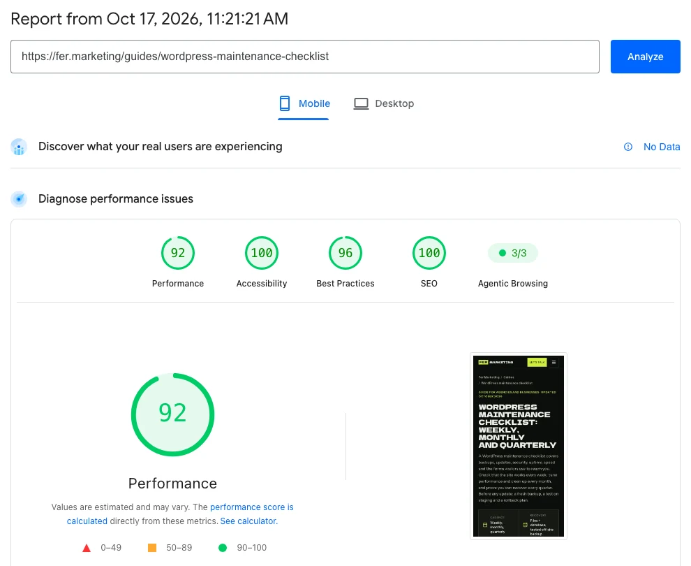
*Guide, mobile: 92 / 100 / 96 / 100. LCP 2.4 s, TBT 260 ms, CLS 0.*
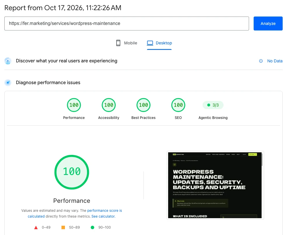
*Service, desktop: 100 / 100 / 100 / 100. LCP 0.6 s, TBT 10 ms, CLS 0.*
Caption order is Performance / Accessibility / Best Practices / SEO. Accessibility scored 100 on our homepage, guide and service page on both devices; the law study scored 99 on mobile and 98 on desktop, so the result is page-specific.
> **Mobile results deserve their own explanation:** PSI mobile simulates a mid-range phone on a slow 4G connection, so it is strict on purpose. Text pages scored 91 to 92 for performance; the animated homepage and chart-rich study scored 79 to 81, while all four tested pages scored 100 for desktop performance.
The reports showed No Data for field results because traffic was still low, and Agentic Browsing 3/3. Neither that result nor an accessibility score certifies a usable menu, successful form delivery or legal compliance; our [WordPress speed guide](https://fer.marketing/wordpress-speed-optimization) explains the loading work in more detail.
## Want a WordPress site people can use on their phones?
We can repair mobile layouts and accessibility barriers, then verify the agreed journeys. Our [web development service](https://fer.marketing/services/white-label-web-development) serves businesses directly and agencies under their own brand.
- Responsive layouts, viewport settings and heading wrapping.
- Mobile navigation, tap-to-call links and unobstructed actions.
- Form labels, keyboard types, error messages and delivery checks.
- Contrast, image alternatives, keyboard access and visible focus.
- Five-width review, real-device checks and a written handoff.
https://fer.marketing/services/white-label-web-development
## FAQ
### What does mobile first indexing mean for WordPress?
Google uses mobile content for indexing and ranking. Keep important service information, headings and metadata available on the mobile page, and make sure the finished site can be read and used on a phone.
### How do I make my WordPress site mobile friendly?
Start with responsive layouts, then review real pages for overflow, small text, tight buttons and obstructive banners. Test the menu, call links and forms on real phones, including with the keyboard open, and repair the elements causing each failure.
### How can I test a website for mobile friendly behavior?
Check browser previews at 360, 390, 414, 768 and 1024 CSS pixels, then complete the main tasks on iPhone Safari and Android Chrome. Use PageSpeed Insights for loading and automated checks, with manual testing for menus, forms, zoom and keyboard access.
### Does a responsive theme guarantee WordPress accessibility?
No. Responsive describes how the layout adapts to the screen. Content, contrast, field labels, keyboard controls and third-party tools still need accessibility review, even when the theme looks good on a phone.
### What is ADA website compliance?
It concerns making a covered organization's website accessible under the Americans with Disabilities Act. The applicable legal requirements depend on the organization and circumstances; technical testing and repairs support access, while questions about legal duties belong with qualified counsel.
### Can an accessibility overlay or a 100 score make my site compliant?
Neither establishes compliance on its own. Automated checks cover only part of accessibility, and a widget cannot replace checking and repairing the actual content, controls and journeys with manual and assistive technology testing.
### Do I need a separate mobile WordPress website?
Usually a responsive site is easier to maintain because the same URL and content adapt to different screens. Before replacing a site, review whether its current theme and components can be repaired without changing the team's publishing workflow.
### Can Fer Marketing handle mobile and accessibility fixes for an agency?
Yes. We work white-label, with staging on the agency domain and NDA and non-solicitation terms available. Development starts from $250 with a fixed written quote before work; the scope defines the pages, repairs and verification included.
Send your URL to fer@fer.marketing for a fixed written quote from $250, a same-business-day reply from 9 AM to 9 PM ET, and white-label delivery for agencies.